We've been focused on publishing African legal information for over three years and have compiled this collection of what we have learned about making online legislation user-friendly.
We conduct ongoing user research to get feedback from our users. We'll update this document as our best practices evolve.
1. Guiding Concepts
1.1 Optimise for readability and understanding
Legislation is written to be read, and it is read to be understood. It is important that it is presented in a way that supports readability and understanding, for the largest possible audience.
1.2 Understand your user and their needs
Research and understand the variety of users that will read your legislation, and what their needs are. Consider:
- What are their backgrounds and assumptions?
- What is their understanding of the law?
- How literate are they?
- How fluent are they in the language your legislation is published in? What about legal terminology?
- What difficulties might they have reading your legislation? This may be due to visual impairment or other accessibility factors.
This will help eliminate guesswork and ground your decision-making in facts and the experiences of real people.
Build user personas to document your users and their needs, and keep them up to date. Conduct interviews or polls and ask for their feedback.
Further reading:
- Learning about users and their needs (gov.uk)
- What works best for the reader? A study on drafting and presenting legislation; Alison Bertlin; The Loophole, May 2014, page 25
1.3 Build for mobile phones first
The majority of African users access the internet on their mobile phones. It is likely that many of your users are using mobile phones with small screens and may have limited internet connectivity.
Adopt a responsive, mobile-first approach and scale upwards, rather than starting big and scaling down.
Further reading:
1.4 Follow web accessibility guidelines
Follow web accessibility guidelines from the W3C to ensure your content is widely accessible, including to users using screen readers or who may be visually impaired.
In many countries, government organisations are required by law to ensure their websites meet W3C accessibility standards.
1.5 Prefer web pages to PDFs
Prefer to publish legislation as web pages rather than PDFs. Web pages are easier to navigate, better for accessibility, work better on mobile phones, are usually smaller (and cheaper) to download, and provide an opportunity for rich functionality to support reading and understanding.
PDFs are useful for print and offline access.
If possible, provide both web pages and PDF versions of your content.
2. Typography
2.1 Use an appropriate font
Use a font that is suitable for legislative documents. Legislation often includes numbered provisions and the choice of font should help readers differentiate between letters and numbers that look similar.
In particular, ensure that these letters and numbers are distinguishable:
- 1, i, I, l, L
- 1, (i), (I), (l), (L)
A serif font usually ensures that these letters and numbers are more visually distinct than a sans-serif font.
Laws.Africa uses PT Serif.
Example:
The table below shows certain numbers and letters in two different font faces. It is easier to differentiate between them in the PT Serif font example, than in the Arial font example.
| Font | Sample 1 | Sample 2 |
|---|---|---|
| Arial |
1 i I l L
|
1 (i) (I) (l) (L)
|
| PT Serif |
1 i I l L
|
1 (i) (I) (l) (L)
|
2.2 Use a reasonable font size
Use a font size that is sufficient across a wide variety of displays. Remember that some readers may have poorer eyesight than others.
We recommend a font size of at least 15 pixels.
Further reading:
2.3 Use sufficient line heights and paragraph spacing
Reasonable line height and spacing makes long legislative documents easier to read.
Spacing between paragraphs that is bigger than the spacing between lines within a paragraph helps to visually separate chunks of text, making it easier to read and skim.
Use a line height between 120% and 135% of the point size. In CSS, this is between 1.2 and 1.35.
Use paragraph spacing between 50% and 100% of the body text size. In CSS, this is between 0.5em and 1em.
Further reading:
2.4 Avoid using justified text
Prefer un-justified (“ragged edge”) lines to justified. While justified text can look cleaner, some studies show that it is more difficult to read, particularly for long texts and for users with visual impairment.
Justified text can also result in odd looking line breaks, particularly for short lines or on small displays such as mobile phones.
Further reading:
3. Formatting
3.1 Apply formatting consistently
Formatting should be applied consistently throughout a document. Inconsistent formatting is jarring to the reader, can be confusing, and looks unprofessional.
Automated formatting helps to ensure that formatting styles are applied consistently within a document, and enables uniform application across multiple documents.
3.2 Differentiate between authoritative content and editorial insertions
Readers must not confuse editorial insertions, such as amendment comments, with the authoritative text of the law.
Format editorial comments differently to authoritative text, such as by using square brackets, italics or a different colour (or a combination).
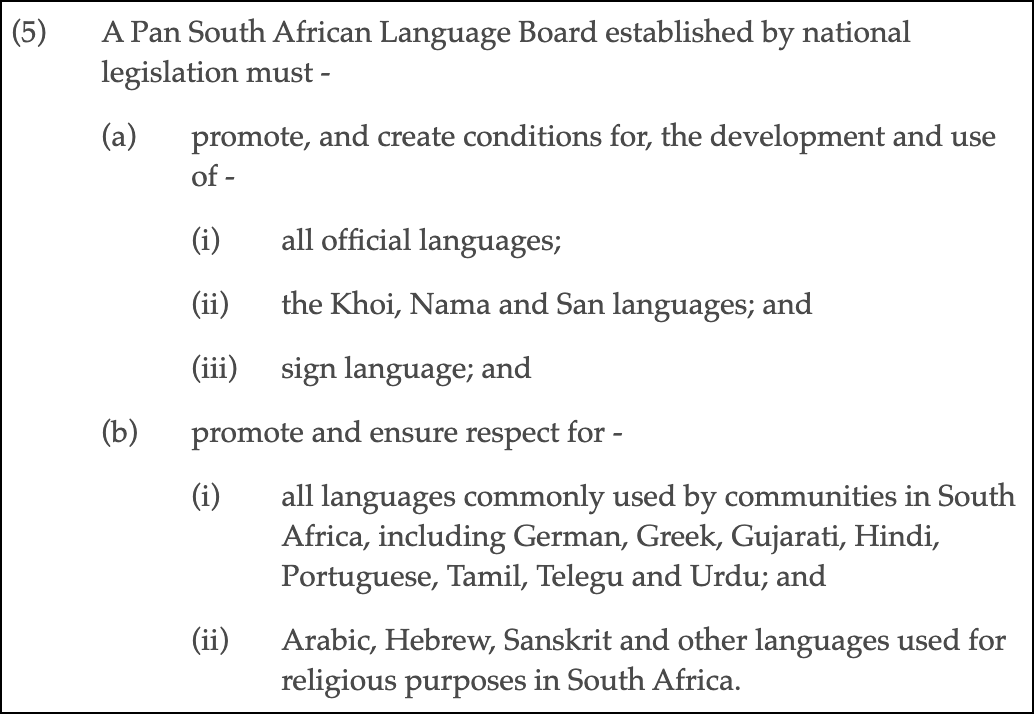
3.3 Create a visual hierarchy
Use indentation, font size and formatting to create a visual hierarchy that mirrors the hierarchy of the legislation.
Legislation is often hierarchical. A sentence can run-on to sometimes many levels of sub-sections and sub-paragraphs. Help the user to navigate this hierarchy by indenting sub-elements underneath their parents, and using headings to demarcate larger portions of the document.
In print layouts, nested indentation is sometimes avoided to maximise the printed area and reduce printing costs. This is not necessary for web pages and can make a document difficult to read.
Example:
Further reading:
- What works best for the reader? A study on drafting and presenting legislation; Alison Bertlin; The Loophole, May 2014, page 25
4. Layout
4.1 Don’t assume all screens or pages are the same width
Not everyone has the same screen size. There is a large variety of screen widths, from mobile phones to laptops and desktops.
Use responsive web design to ensure that the document looks good at multiple screen sizes.
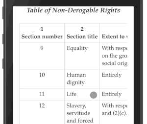
Images and tables in particular must support different page sizes.
4.2 Make images responsive
Images embedded in the document should not have a fixed width. Instead, they should expand or contract to fill their container (eg. width: 100%). This will ensure that they are not too big on small screens, and not too small on big screens.
4.3 Use percentages for table column widths
Table column widths should be relative (ie. percentages) and not absolute widths, to ensure that they display correctly on a variety of screen sizes.
Allow wide tables and tables with many columns to scroll horizontally on small screens.
Example:
4.4 Place footnotes near to where they are referenced
Position footnotes near to where they are referenced in the text, rather than right at the end of the document.
On long web pages there is no natural page footer to place footnotes in. Placing them at the end of the document forces the reader to jump backwards and forwards.
Instead, place them below the paragraph or section in which they are referenced, or in a gutter to the side of the referenced text. This makes it easier for the reader to read the footnote without losing context.
5. Navigation
5.1 Help the reader understand where they are in the document
Provide contextual clues to help the reader navigate the document. Legal research often involves jumping within and between documents, and providing context helps the reader to navigate.
Contextual clues can include:
- A table of contents that is always available, either alongside the document (wide screens) or available as a popup or flyout (small screens).
- Highlight the currently visible provision in the table of contents as the user scrolls through the document.
- Anchor major provision headings to the top of the screen as the user scrolls.
5.2 Help the user to navigate the document
Provide mechanisms to help users move around in a document.
Reading legislation often requires moving between provisions or jumping between terms and their definitions.
Mechanisms to help with this include:
- Show internal and external references as clickable links.
- Differentiate between internal and external references.
- Show previews of referenced provisions as popups, avoiding the need to click through to a provision and then back again.
- Show the definitions of specific terms as popups.